Financial Loss Minimization
Introduction
Imagine you work for a travel company and you want to predict whether a particular trip booking will fall into one category or another — maybe “premium” versus “standard,” or “likely to cancel” versus “likely to keep.” With 160,000 historical bookings and 50 different pieces of information about each one, manually sorting through the data would be impossible. This is exactly the kind of problem that machine learning can solve.
In this case study, we walk through a complete data science workflow: exploring the data, cleaning it up, and then building predictive models that can automatically classify future bookings. The entire project was carried out in Python, and we will break down each step in plain language so anyone can follow along.
What Does the Data Look Like?
Our dataset contains 160,000 records with 50 input features and 1 outcome label (called “y”). The outcome is binary — it takes only two values, 0 or 1 — making this a classification problem, where the goal is to assign each record to one of two groups.
Out of the 50 input features:
- 45 are numeric — continuous numbers like measurements or scores.
- 5 are categorical — text-based labels describing things like geography, time, and percentages.
The five categorical features turned out to be quite informative:
| Feature | What It Represents | Example Values |
|---|---|---|
| x24 | Continent | Asia, Europe, America |
| x29 | Month | June, July, August |
| x30 | Day of the week | Monday through Friday |
| x32 | Percentage change | 0.0%, 0.01%, -0.01% |
| x37 | Dollar amount | $1313.96, $-620.66 |
Looking at these features together, the data appears to describe cross-continent summer holiday travel activity — most events occur in Asia during summer months and on weekdays.
Data Preview
Below is a scrollable preview of the first 10 rows (out of 160,000). Scroll horizontally to see all 51 columns.
⬇ Download the full dataset (final_project.csv.tar.gz)
| x0 | x1 | x2 | x3 | x4 | x5 | x6 | x7 | x8 | x9 | x10 | x11 | x12 | x13 | x14 | x15 | x16 | x17 | x18 | x19 | x20 | x21 | x22 | x23 | x24 | x25 | x26 | x27 | x28 | x29 | x30 | x31 | x32 | x33 | x34 | x35 | x36 | x37 | x38 | x39 | x40 | x41 | x42 | x43 | x44 | x45 | x46 | x47 | x48 | x49 | y |
|---|---|---|---|---|---|---|---|---|---|---|---|---|---|---|---|---|---|---|---|---|---|---|---|---|---|---|---|---|---|---|---|---|---|---|---|---|---|---|---|---|---|---|---|---|---|---|---|---|---|---|
| -0.1666 | -3.9616 | 4.6211 | 2.4819 | -1.8001 | 0.8047 | 6.7188 | -14.7900 | -1.0407 | -4.2049 | 6.1875 | 13.2515 | 25.6654 | -5.0173 | 10.5037 | -2.5177 | 2.1179 | 5.8659 | -6.6662 | 1.7915 | -1.9091 | -1.7379 | -2.5167 | 3.5530 | euorpe | -0.8013 | 1.1429 | 1.0051 | -18.4738 | July | tuesday | -3.8517 | 0.0% | -1.9400 | -5.4921 | 0.6271 | -0.8738 | $1313.96 | -1.3537 | -5.1861 | -10.6122 | -1.4971 | 5.4141 | -2.3257 | 1.6748 | -0.2643 | 60.7814 | -7.6897 | 0.1516 | -8.0402 | 0 |
| -0.1499 | -0.5857 | 27.8399 | 4.1523 | 6.4268 | -2.4269 | 40.4771 | -6.7257 | 0.8964 | 0.3302 | -11.7089 | -2.3528 | -25.0149 | 9.7996 | -10.9607 | 1.5040 | -2.3978 | -9.3018 | -1.9994 | 5.0453 | -5.8100 | 10.8143 | -0.4781 | 10.5906 | asia | 0.8188 | -0.6430 | 0.7511 | 3.7494 | Aug | wednesday | 1.3916 | -0.02% | 2.2115 | -4.4606 | 1.0355 | 0.2283 | $1962.78 | 32.8168 | -5.1500 | 2.1474 | 36.2928 | 4.4909 | 0.7626 | 6.5267 | 1.0079 | 15.8057 | -4.8967 | -0.3203 | 16.7200 | 0 |
| -0.3217 | -1.4298 | 12.2516 | 6.5869 | -5.3046 | -11.3111 | 17.8128 | 11.0606 | 5.3259 | -2.6330 | 1.5726 | -4.1708 | 12.0786 | -5.1585 | 7.3028 | -2.1924 | -4.0654 | -7.6751 | 4.0416 | -6.6336 | 1.7003 | -2.4192 | 2.4675 | -5.2706 | asia | -0.7183 | -0.5668 | 4.1711 | 11.5224 | July | wednesday | -3.2621 | -0.01% | 0.4196 | -3.8041 | -0.7634 | -1.6126 | $430.47 | -0.3332 | 8.7286 | -0.8631 | -0.3685 | 9.0889 | -0.6899 | -2.7311 | 0.7542 | 30.8564 | -7.4286 | -2.0908 | -7.8694 | 0 |
| -0.2456 | 5.0767 | -24.1496 | 3.6373 | 6.5058 | 2.2902 | -35.1118 | -18.9136 | -0.3370 | -5.5681 | -2.0003 | -19.2867 | 10.9953 | -5.9144 | 2.5114 | 1.2924 | -2.4969 | -15.7230 | -2.7354 | 1.1175 | 1.9237 | -14.1792 | 1.4706 | -11.4844 | asia | -0.0524 | -0.5586 | 9.2156 | 30.5952 | July | wednesday | -2.2852 | 0.01% | -3.4427 | 4.4202 | 1.1645 | 3.0335 | $-2366.29 | 14.1887 | -6.3851 | 12.0844 | 15.6915 | -7.4678 | 2.9408 | -6.4241 | 0.4198 | -72.4246 | 5.3614 | 1.8061 | -7.6708 | 0 |
| -0.2734 | 0.3063 | -11.3526 | 1.6768 | 2.9284 | -0.6168 | -16.5058 | 27.5323 | 1.1997 | -4.3091 | 6.6675 | 1.9659 | -28.1063 | -1.2589 | 5.7599 | 0.4726 | -1.1501 | -14.1187 | 4.5280 | -1.2844 | -9.0263 | -7.0398 | -1.9787 | -15.9982 | asia | -0.2234 | 0.3508 | 1.8112 | -4.0941 | July | tuesday | 0.9210 | 0.01% | -0.4316 | 12.1655 | -0.1677 | -0.3416 | $-620.66 | -12.5789 | 1.1338 | 30.0047 | -13.9113 | -5.2299 | 1.7839 | 3.9578 | -0.0970 | -14.0854 | -0.2084 | -0.8949 | 15.7247 | 1 |
Showing 5 of 160,000 rows × 51 columns. Scroll right to see all features.
Step 1: Handling Missing Data
Real-world data is rarely perfect. When we checked for missing information, we found that many features had small gaps — but none exceeded 0.03% of all records. Importantly, the outcome label had no missing values at all.
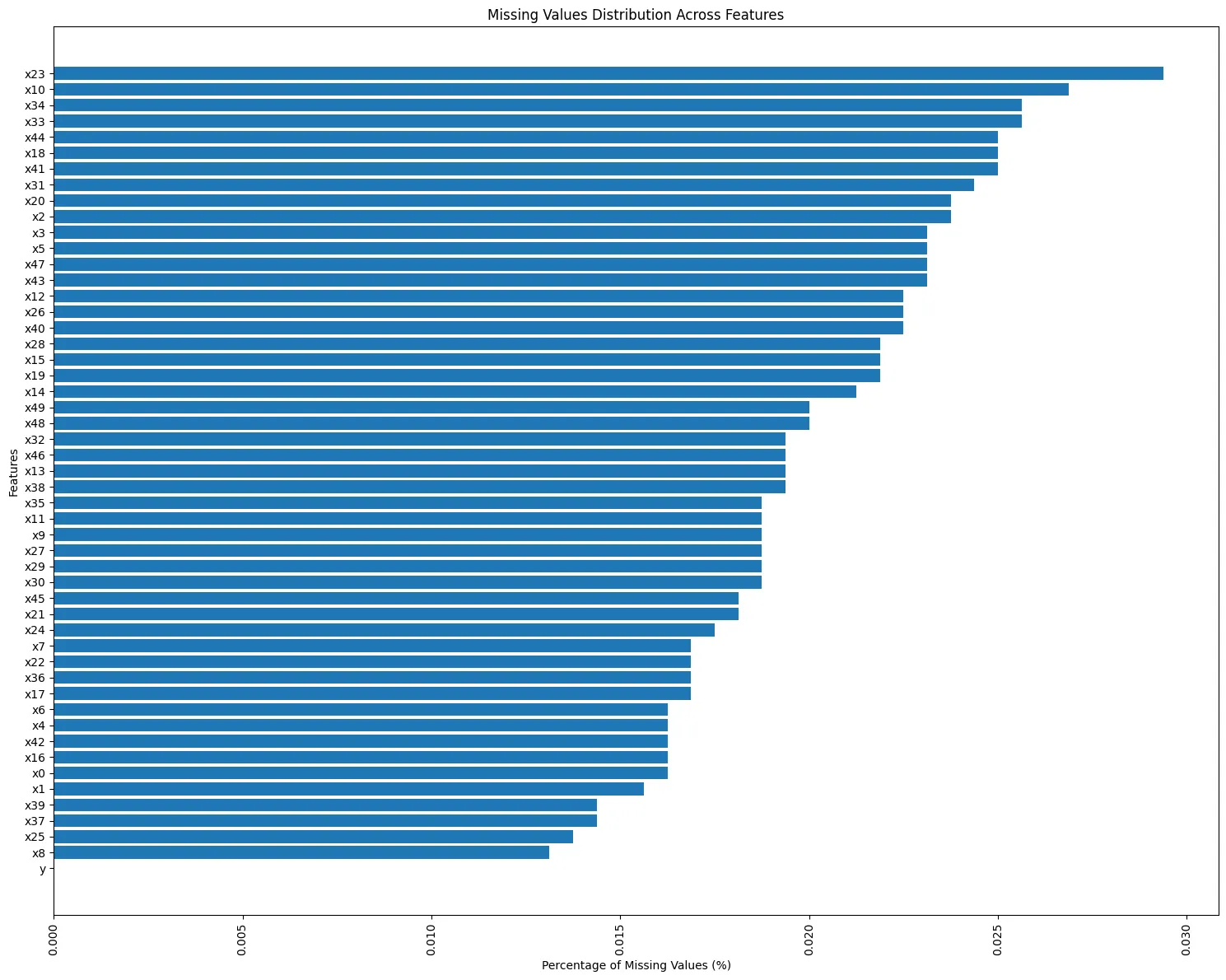 Figure 1: The percentage of missing values across all features. The gaps are tiny — well under 0.05% for every feature.
Because the amount of missing data was so small, we used two simple strategies to fill in the blanks:
- For numeric features, we used a technique called K-Nearest Neighbors (KNN) Imputation. In simple terms, when a value is missing, the algorithm looks at the five most similar records and fills in the gap using their average.
- For categorical features, we simply used the most frequently occurring value as the replacement.
Step 2: Understanding the Outcome Distribution
Before building any model, we wanted to know how balanced our two outcome groups were. It turned out that about 60% of records belonged to class 1 and 40% to class 0.
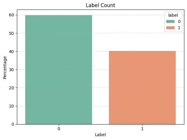 Figure 2: The split between the two outcome groups (0 and 1). A 40/60 split is well-balanced, meaning neither group overwhelms the other.
This is good news — when one group is far larger than the other (say 99% vs. 1%), models can “cheat” by always guessing the bigger group. A 40/60 split avoids that trap.
Step 3: Exploring the Categorical Features
We dug deeper into the four text-based features to see what stories they told:
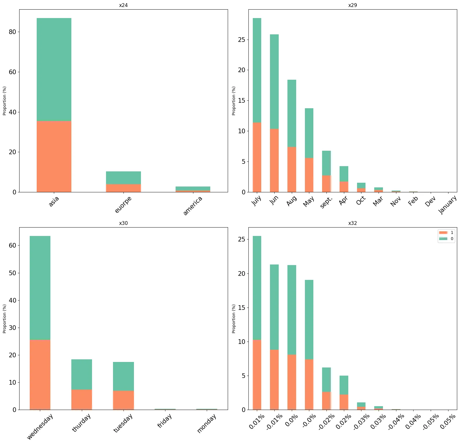 Figure 3: Bar charts showing how the categorical features break down by outcome group.
Key takeaways:
- Continent (x24): A striking 85% of records originate from Asia, with only 10% from Europe and 5% from America.
- Month (x29): Summer months (June, July, August) dominate — together they account for over 75% of all records.
- Day of week (x30): Activity is concentrated on weekdays, peaking on Wednesday. Weekends show virtually zero activity, and Monday/Friday have very low counts.
- Percentage change (x32): About 90% of values fall in the narrow range of 0.0% to 0.01%, indicating very small fluctuations.
These patterns are consistent with seasonal business travel — heavy during summer, concentrated on core weekdays, and centered in Asia.
Step 4: Checking Relationships Among Features
When features are highly correlated (i.e., they essentially carry the same information), including both can confuse or slow down models without adding value. We computed the correlations among all 46 numeric features and found that only 4 pairs had a correlation above 0.7.
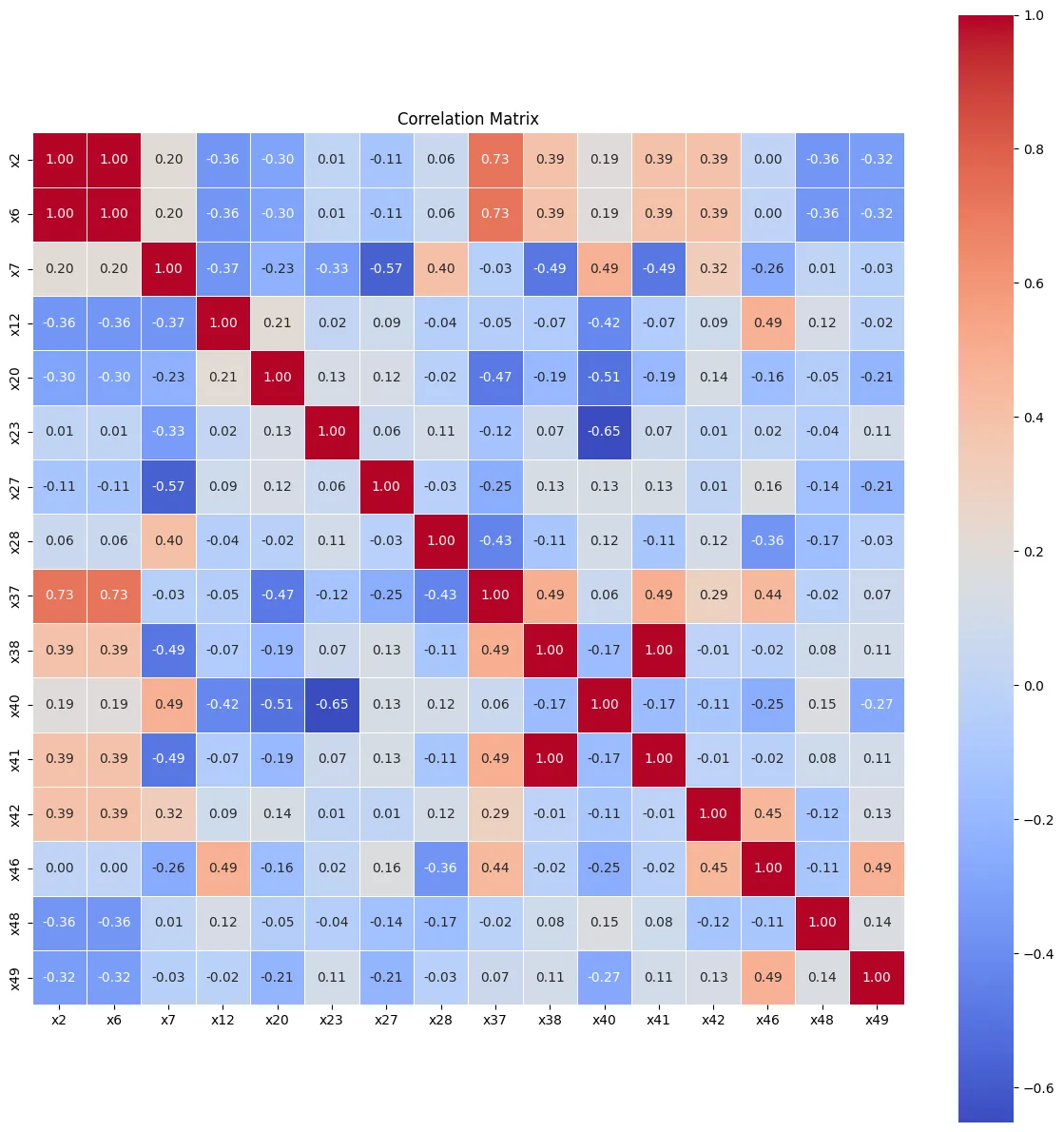 Figure 4: A heatmap of correlations among the numeric features flagged by VIF analysis. Darker red or blue squares indicate stronger relationships.
Two pairs stood out — (x2, x6) and (x38, x41) — so we removed one feature from each pair (x6 and x41) to reduce redundancy before training some of our models.
Step 5: Visualizing the Numeric Features
We also plotted histograms for all numeric features to check their shape. Every single one displayed a bell-shaped (Gaussian) distribution, which is a sign of well-behaved data.
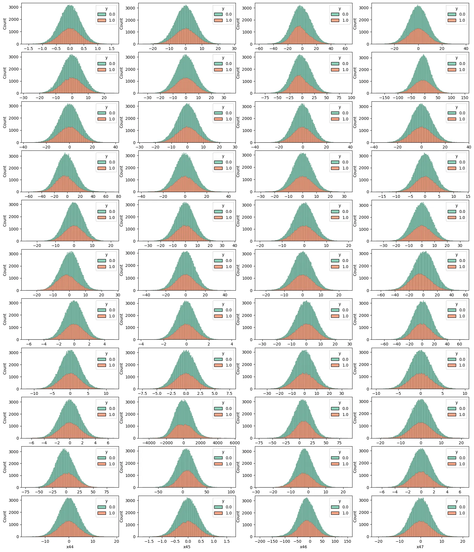 Figure 5: Histograms for all numeric features, color-coded by outcome group. The bell-curve shape is consistent across the board.
Because we planned to use tree-based models (which split data based on thresholds rather than distances), we did not need to rescale these features to a common range — trees naturally handle different scales.
Step 6: Building the Models
We trained four models using two popular machine learning algorithms:
- Random Forest (RF) — an ensemble method that builds many decision trees and combines their votes.
- XGBoost — a more advanced boosting algorithm that builds trees sequentially, with each new tree correcting the mistakes of the previous ones.
For each algorithm, we trained two versions:
| Model | Features Used |
|---|---|
| RF Full | All features |
| RF Selected | Reduced features (correlated ones removed) |
| XGBoost Full | All features |
| XGBoost Selected | Reduced features |
How Did They Perform?
We evaluated each model on a held-out test set — data the models had never seen during training — using two key metrics:
- Accuracy: What percentage of predictions were correct overall?
- AUC (Area Under the ROC Curve): How well can the model distinguish between the two groups? An AUC of 1.0 means perfect separation; 0.5 means no better than flipping a coin.
Step 7: Comparing the Results
The ROC curve below tells the full story:
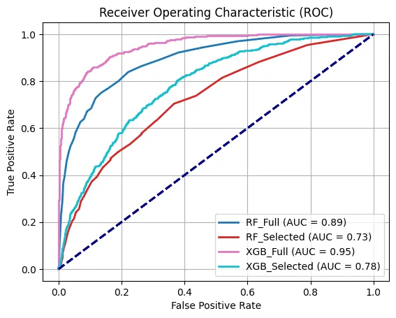 Figure 6: ROC curves for all four models. The closer a curve hugs the top-left corner, the better the model is at distinguishing between the two groups.
| Model | Accuracy | AUC |
|---|---|---|
| RF Full | 96% | High |
| RF Selected | 95% | Lower |
| XGBoost Full | 97% | Highest |
| XGBoost Selected | 95% | Lower |
The XGBoost model trained on all features was the clear winner, achieving 97% accuracy and the highest AUC score. This tells us two things:
- XGBoost outperformed Random Forest in this scenario, likely because its sequential correction mechanism captures subtle patterns that independent trees miss.
- Using all features was better than the reduced set, meaning even the correlated features contributed useful information that improved predictions.
What Makes a Feature Important?
One of the advantages of tree-based models is that they can tell us which features matter most. The chart below shows the feature importances from the best-performing XGBoost model:
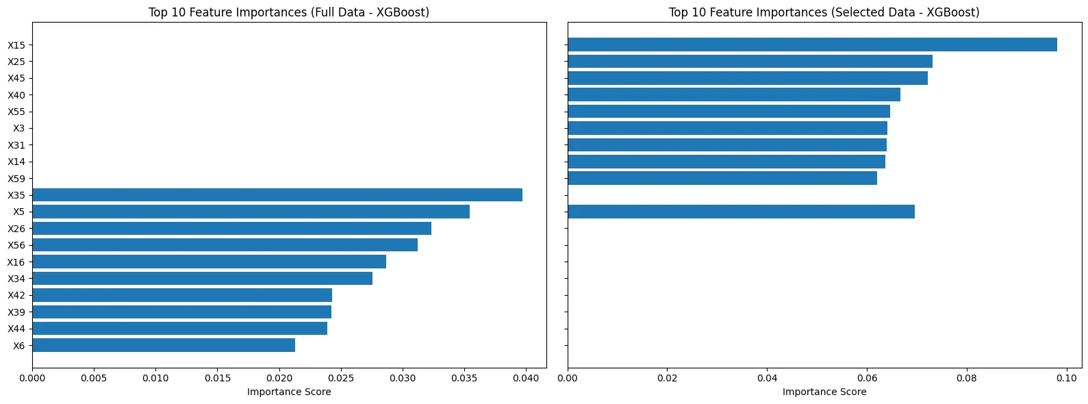 Figure 7: Feature importance scores from XGBoost. Taller bars indicate features that had more influence on the model’s decisions.
This kind of insight is valuable beyond just prediction — it helps the business understand what factors drive the outcome, enabling smarter decisions about data collection, strategy, and resource allocation.
Key Takeaways
-
Data quality matters. Even though the dataset had missing values, they were so few (under 0.03%) that simple imputation techniques worked well. Always check your data before jumping to modeling.
-
Exploratory analysis reveals hidden stories. By simply plotting the categorical features, we uncovered that the data likely represents summer business travel in Asia — context that can guide both model design and business interpretation.
-
Feature engineering has limits. Removing correlated features actually hurt model performance. Tree-based models are already good at handling redundancy, so aggressive feature pruning may do more harm than good.
-
XGBoost is a powerful default choice. For tabular data (rows and columns, like spreadsheets), XGBoost consistently ranks among the top-performing algorithms. In this study it delivered 97% accuracy with minimal tuning.
-
Model interpretability is a bonus. Feature importance plots let us peek inside the “black box” and understand which inputs the model relies on — a critical step for building trust and driving action.
Conclusion
This case study demonstrated a complete machine learning pipeline — from raw data to validated predictions — using Python’s scikit-learn and XGBoost libraries. The best model (XGBoost with all features) achieved an impressive 97% accuracy, showing that with careful data preparation and the right algorithm, we can build reliable predictive systems even from anonymized datasets.
Whether you are classifying travel bookings, predicting customer behavior, or sorting through medical records, the workflow is remarkably similar: explore, clean, model, evaluate, and interpret. The tools change, but the process stays the same.