Predicting Hospital Readmission for Diabetes Patients: A Data Science Walkthrough
Can we predict whether a diabetes patient will be readmitted to the hospital? That’s the question I set out to answer using a real-world clinical dataset with over 100,000 patient encounters. In this post, I’ll walk you through the entire journey — from messy raw data to a working predictive model — and share lessons learned along the way.
The Dataset at a Glance
The dataset comes from 130 U.S. hospitals and covers 10 years of clinical care for diabetic patients. Each row represents a single hospital encounter, and each column captures a different piece of information about the patient or their visit.
- 101,766 encounters (rows)
- 50 variables (columns), including demographics, diagnoses, medications, and lab results
- Target variable:
readmitted— whether the patient was readmitted to the hospital (<30days,>30days, orNO)
Variables range from basic demographics like race, gender, and age, to clinical details like time_in_hospital, num_lab_procedures, and over 20 individual medication columns (e.g., metformin, insulin, glipizide).
Data Preview
Below is a scrollable preview of the first 5 rows (out of 101,766). Scroll horizontally to see all 50 columns.
⬇ Download the full dataset (diabetic_data.csv.tar.gz)
| encounter_id | patient_nbr | race | gender | age | weight | admission_type_id | discharge_disposition_id | admission_source_id | time_in_hospital | payer_code | medical_specialty | num_lab_procedures | num_procedures | num_medications | number_outpatient | number_emergency | number_inpatient | diag_1 | diag_2 | diag_3 | number_diagnoses | max_glu_serum | A1Cresult | metformin | repaglinide | nateglinide | chlorpropamide | glimepiride | acetohexamide | glipizide | glyburide | tolbutamide | pioglitazone | rosiglitazone | acarbose | miglitol | troglitazone | tolazamide | examide | citoglipton | insulin | glyburide-metformin | glipizide-metformin | glimepiride-pioglitazone | metformin-rosiglitazone | metformin-pioglitazone | change | diabetesMed | readmitted |
|---|---|---|---|---|---|---|---|---|---|---|---|---|---|---|---|---|---|---|---|---|---|---|---|---|---|---|---|---|---|---|---|---|---|---|---|---|---|---|---|---|---|---|---|---|---|---|---|---|---|
| 2278392 | 8222157 | Caucasian | Female | [0-10) | ? | 6 | 25 | 1 | 1 | ? | Pediatrics-Endocrinology | 41 | 0 | 1 | 0 | 0 | 0 | 250.8300 | ? | ? | 1 | None | None | No | No | No | No | No | No | No | No | No | No | No | No | No | No | No | No | No | No | No | No | No | No | No | No | No | NO |
| 149190 | 55629189 | Caucasian | Female | [10-20) | ? | 1 | 1 | 7 | 3 | ? | ? | 59 | 0 | 18 | 0 | 0 | 0 | 276 | 250.0100 | 255 | 9 | None | None | No | No | No | No | No | No | No | No | No | No | No | No | No | No | No | No | No | Up | No | No | No | No | No | Ch | Yes | >30 |
| 64410 | 86047875 | AfricanAmerican | Female | [20-30) | ? | 1 | 1 | 7 | 2 | ? | ? | 11 | 5 | 13 | 2 | 0 | 1 | 648 | 250 | V27 | 6 | None | None | No | No | No | No | No | No | Steady | No | No | No | No | No | No | No | No | No | No | No | No | No | No | No | No | No | Yes | NO |
| 500364 | 82442376 | Caucasian | Male | [30-40) | ? | 1 | 1 | 7 | 2 | ? | ? | 44 | 1 | 16 | 0 | 0 | 0 | 8 | 250.4300 | 403 | 7 | None | None | No | No | No | No | No | No | No | No | No | No | No | No | No | No | No | No | No | Up | No | No | No | No | No | Ch | Yes | NO |
| 16680 | 42519267 | Caucasian | Male | [40-50) | ? | 1 | 1 | 7 | 1 | ? | ? | 51 | 0 | 8 | 0 | 0 | 0 | 197 | 157 | 250 | 5 | None | None | No | No | No | No | No | No | Steady | No | No | No | No | No | No | No | No | No | No | Steady | No | No | No | No | No | Ch | Yes | NO |
Showing 5 of 101,766 rows × 50 columns. Scroll right to see all features.
Step 1: Exploratory Data Analysis — What Does the Data Look Like?
Before building any model, we need to understand the data. The very first thing I noticed? Missing values — lots of them.
The Missing Data Problem
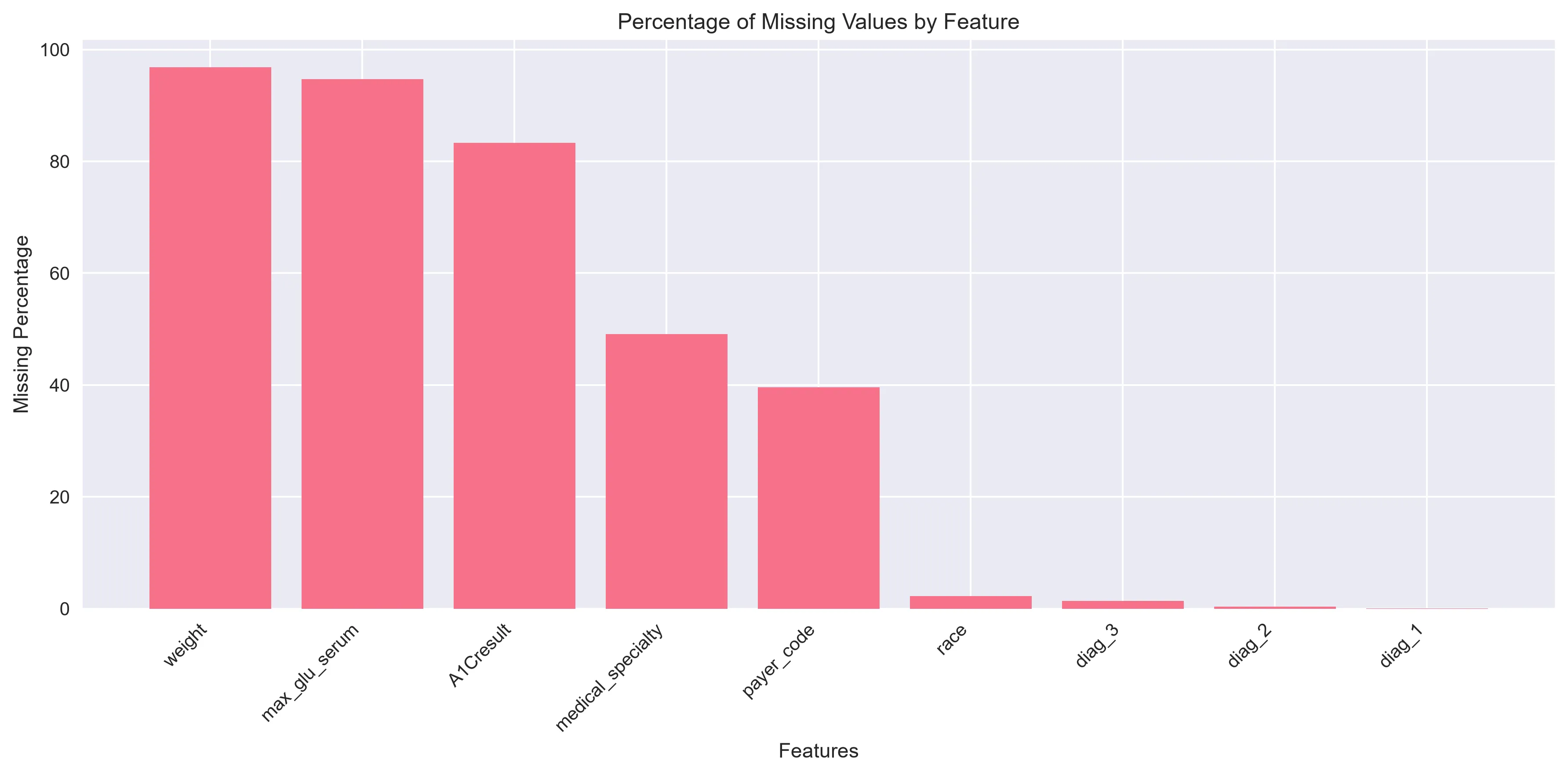 Percentage of missing values across all features with at least one missing entry.
The chart tells a dramatic story. Here are the key numbers:
| Feature | Missing % |
|---|---|
weight | 96.86% |
max_glu_serum | 94.75% |
A1Cresult | 83.28% |
medical_specialty | 49.08% |
payer_code | 39.56% |
race | 2.23% |
diag_3 | 1.40% |
diag_2 | 0.35% |
diag_1 | 0.02% |
Nearly 97% of weight values are missing. While weight is obviously important for diabetes management, there’s simply not enough data to work with. Similarly, lab results like max_glu_serum (maximum glucose serum test) and A1Cresult (a key diabetes marker) are missing in the vast majority of records.
Why does this matter? If a variable is missing for most patients, trying to fill in the blanks (a process called imputation) can introduce more noise than signal. It’s often better to drop these columns entirely rather than guess at values we don’t have.
The Decision: Drop vs. Impute
Here’s the strategy I used:
- Dropped (too much missing data to be useful):
weight,max_glu_serum,A1Cresult,medical_specialty,payer_code - Imputed (small enough missing percentage to handle reliably):
race,diag_1,diag_2,diag_3
For race (2.23% missing), I used mode imputation — simply filling in the most common value. For the diagnosis codes, I created an "Unknown" category. This preserves the information that the value is missing, which can itself be a useful signal.
Understanding the Numerical Features
To get a feel for the data, I examined the distribution of each numerical variable. Here are a few highlights:
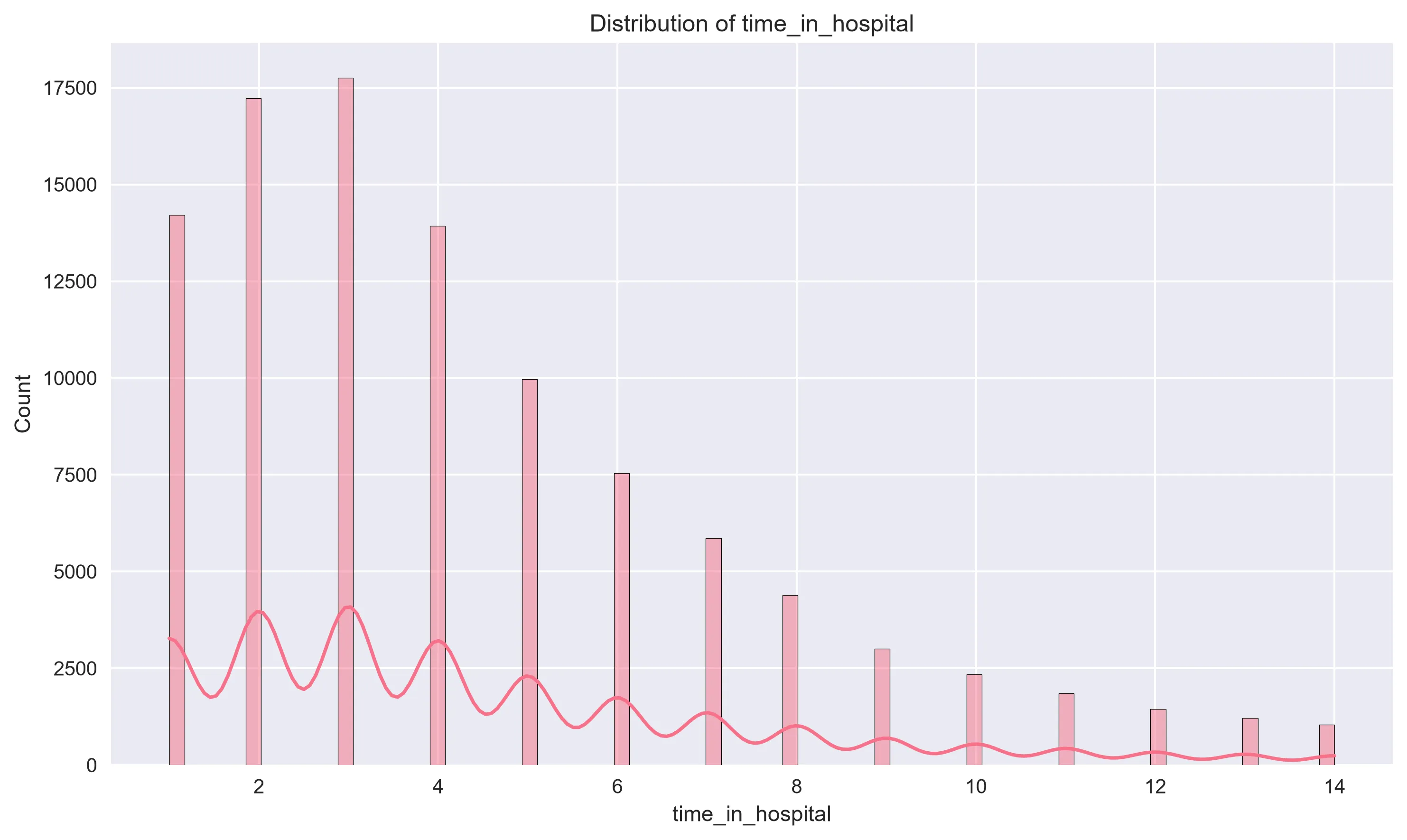 Most hospital stays cluster between 1–5 days, with a long right tail for extended visits.
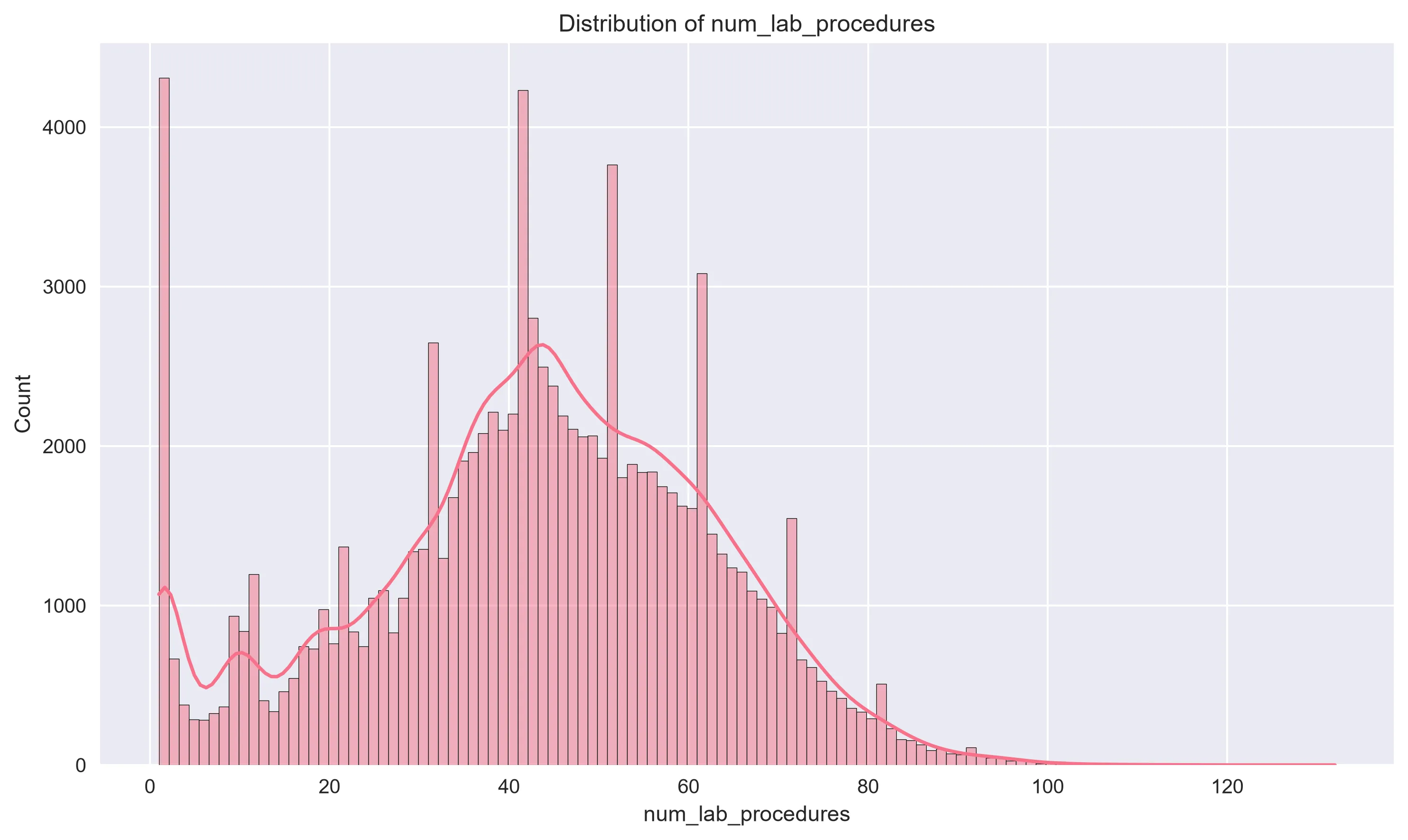 Lab procedure counts follow a roughly normal distribution centered around 40–50 per encounter.
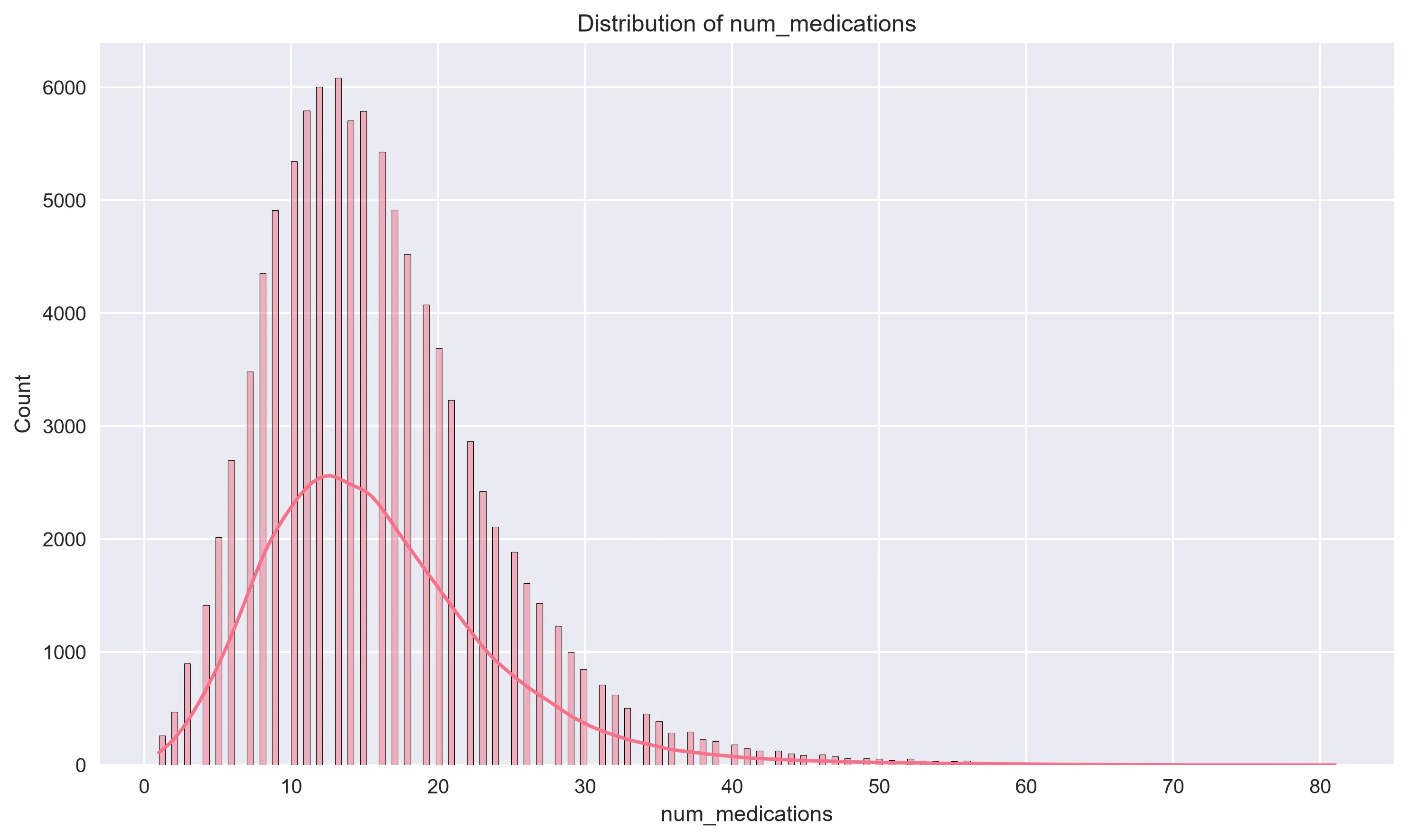 Medication counts peak around 10–15, reflecting the polypharmacy common in diabetes care.
These distributions reveal important patterns: most encounters are relatively short stays with moderate numbers of procedures, but there are always outliers with extreme values that the model needs to handle.
Correlation Analysis
Next, I looked at how the numerical features relate to each other using a correlation matrix:
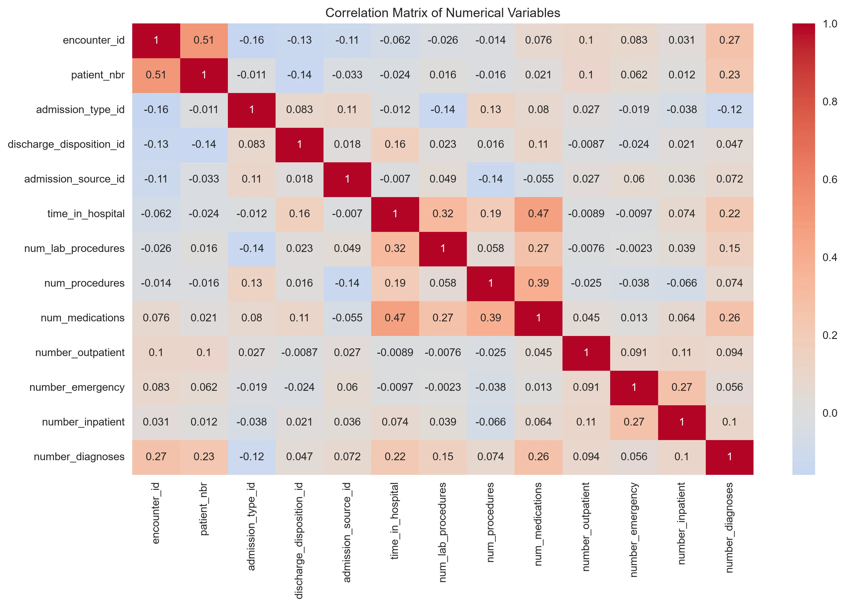 Correlation heatmap of all numerical features. Stronger colors indicate stronger relationships.
A few things stand out:
num_medicationsandtime_in_hospitalhave a positive correlation — patients who stay longer tend to receive more medications (which makes intuitive clinical sense).num_lab_proceduresalso correlates with hospital stay duration.- Most features show low mutual correlation, which is good news for our model — it means each feature is contributing relatively independent information.
Checking for Multicollinearity (VIF Analysis)
I also ran a Variance Inflation Factor (VIF) analysis on the numerical features. VIF measures how much the variance of a regression coefficient increases due to collinearity with other predictors. A VIF above 5 is a warning sign; above 10 signals serious multicollinearity.
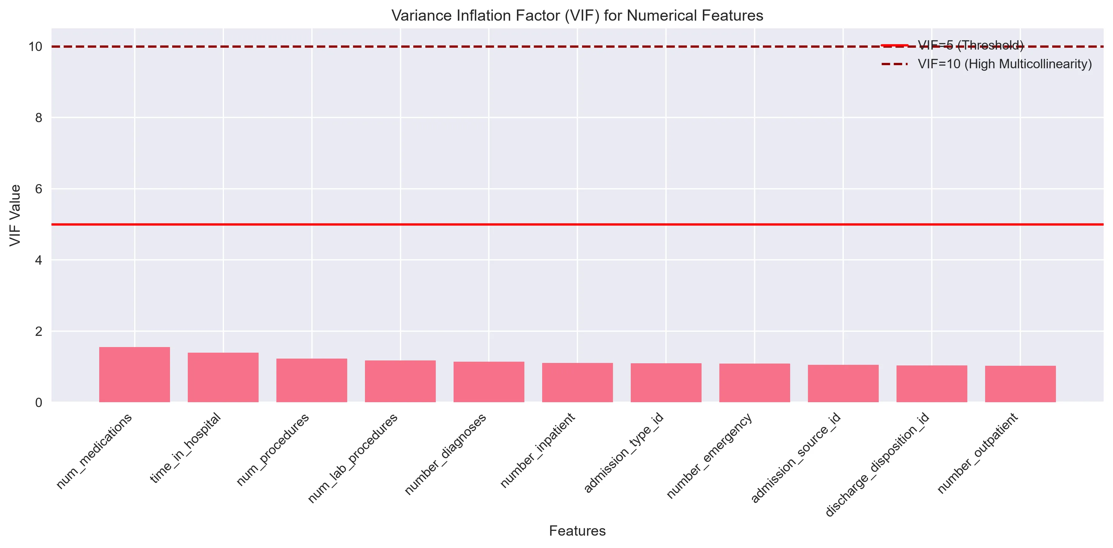 VIF values for all numerical features. The red line at VIF=5 marks the typical concern threshold; the dashed line at VIF=10 marks high multicollinearity.
The good news: all VIF values are well below 5, with num_medications topping the list at just ~1.56. This means our numerical features are not redundant with one another, and a regression model can reliably estimate their individual effects.
Step 2: Feature Engineering — Creating Better Inputs
Raw data rarely tells the full story. Feature engineering is the art of creating new variables that help a model learn patterns more effectively.
Here are the new features I created:
| New Feature | Description |
|---|---|
age_numeric | Converted age ranges (e.g., [50-60)) into midpoint numbers (e.g., 55) |
previous_visits | Sum of outpatient + emergency + inpatient visits |
on_any_diabetes_med | Binary flag: Is the patient on any diabetes medication? |
had_med_change | Binary flag: Was any medication changed during this visit? |
total_med_changes | Count of medications that were adjusted (dosage up or down) |
The idea behind previous_visits is that patients with a long history of hospital interactions may have different readmission risk profiles. Similarly, total_med_changes captures the intensity of treatment adjustments — a patient whose medications are being actively tuned might be in a different clinical state than one on a stable regimen.
Step 3: Building the Preprocessing Pipeline
With dozens of features — some numerical, some categorical — we need a systematic way to prepare the data for modeling. I built a scikit-learn preprocessing pipeline that handles both types:
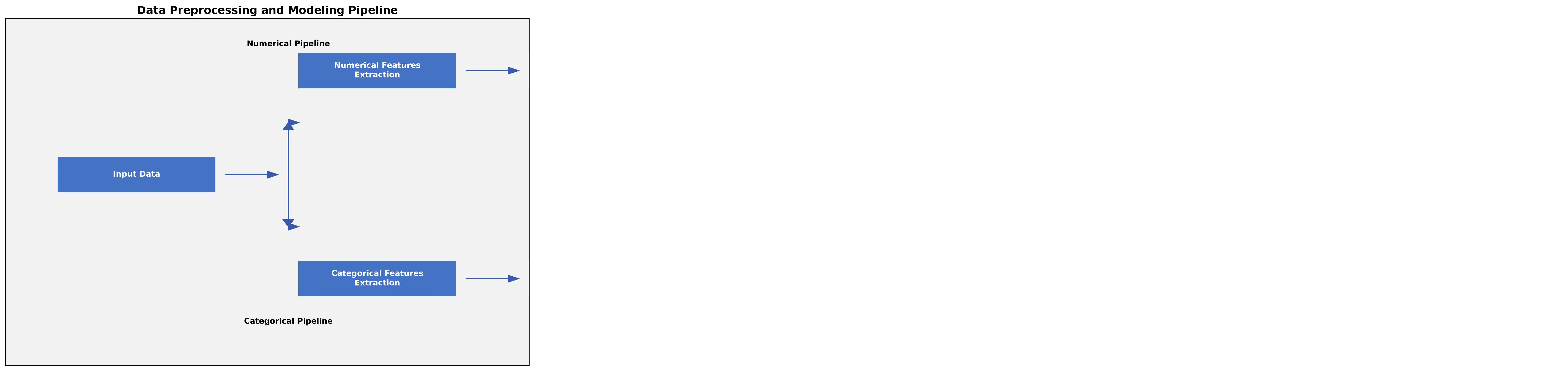 Visual overview of the data preprocessing and modeling pipeline, from raw input through to readmission predictions.
Numerical Features
- KNN Imputation (k=5): For any remaining missing numerical values, the algorithm looks at the 5 most similar patients and uses their values to fill in the gap.
- Standardization: Scales all numerical features to have a mean of 0 and standard deviation of 1. This is important for algorithms like logistic regression that are sensitive to feature scales.
Categorical Features
- One-Hot Encoding: Converts each categorical value into its own binary (0/1) column. For example, the
racecolumn becomesrace_Caucasian,race_AfricanAmerican, etc.
Using a pipeline ensures that the exact same transformations are applied consistently to both training and test data — avoiding a common pitfall called data leakage, where information from the test set accidentally influences the training process.
Step 4: The Model — Multinomial Logistic Regression
I chose logistic regression as the modeling approach. It’s a well-understood, interpretable algorithm that works well for classification problems. Since the target variable has three classes (<30, >30, NO), I used the multinomial variant with the lbfgs solver.
The data was split 75/25 into training and test sets, with stratified sampling to maintain the same class distribution in both splits. The readmission classes break down as follows:
| Readmission Status | Count | Percentage |
|---|---|---|
| NO | 54,864 | 53.9% |
| >30 days | 35,545 | 34.9% |
| <30 days | 11,357 | 11.2% |
Notice the class imbalance: patients readmitted within 30 days make up only ~11% of the dataset. This is a challenge we’ll see reflected in the results.
Why Logistic Regression?
For a problem like this, interpretability matters. Hospital administrators and clinicians don’t just want a prediction — they want to understand why a patient is flagged as high-risk. Logistic regression provides coefficients for each feature, making it straightforward to identify the top drivers of readmission.
Step 5: Results and Key Findings
Overall Performance
The model achieved an accuracy of 57.5% on the test set. Here’s the detailed classification report:
| Class | Precision | Recall | F1-Score | Support |
|---|---|---|---|---|
| <30 | 0.34 | 0.03 | 0.05 | 2,839 |
| >30 | 0.49 | 0.35 | 0.41 | 8,887 |
| NO | 0.60 | 0.84 | 0.70 | 13,716 |
The model does best at predicting patients who will not be readmitted (84% recall for “NO”), but struggles significantly with the <30 day readmission class (only 3% recall). This is a direct consequence of the class imbalance — with only 11% of encounters falling in the <30 class, the model rarely predicts it.
Confusion Matrix
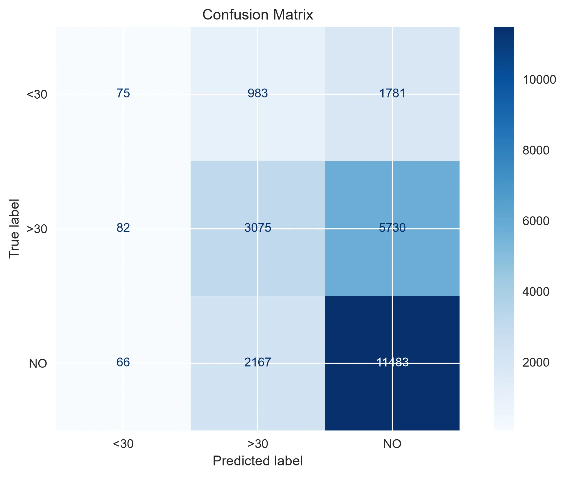 The confusion matrix shows where the model gets it right and where it makes mistakes. The diagonal represents correct predictions.
The confusion matrix visualizes this pattern clearly: the model is heavily biased toward predicting “NO” (not readmitted), which is the majority class. Many patients who were readmitted within 30 days are misclassified as “NO” or “>30”.
ROC Curves
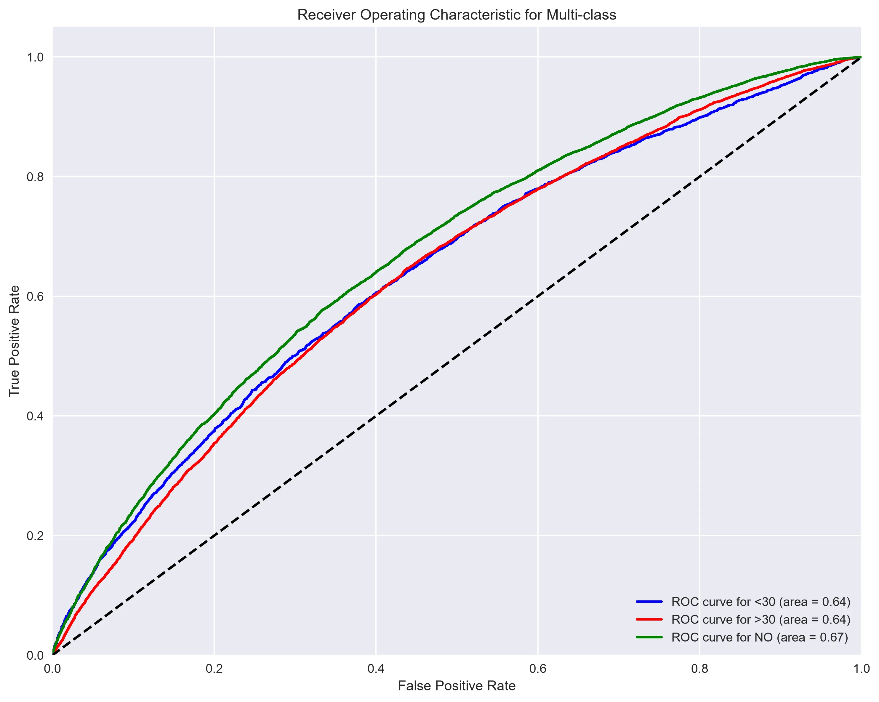 ROC curves for each readmission class. The closer a curve is to the top-left corner, the better the model discriminates that class. The dashed diagonal represents random guessing.
The ROC curves give a more nuanced picture of model performance. While the model is far from perfect, it performs meaningfully better than random chance for all three classes — the curves all rise above the diagonal baseline.
Feature Importance
One of the most valuable outputs of logistic regression is the ability to see which features have the strongest influence on each outcome class:
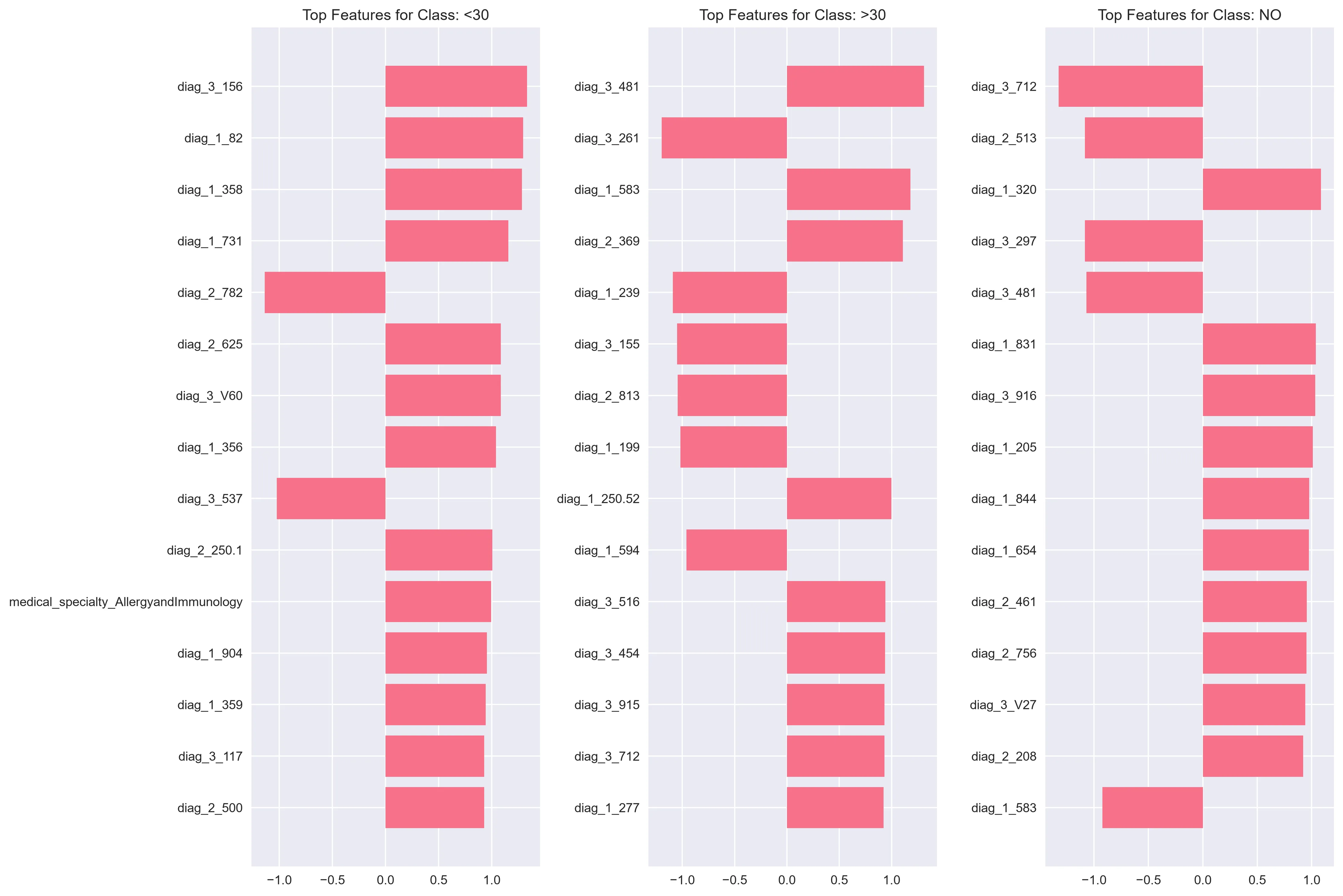 Top 15 features by coefficient magnitude for each readmission class. Positive values push toward that class; negative values push away from it.
Key observations:
- Discharge disposition — where the patient goes after leaving the hospital — emerged as a highly influential factor across all classes.
- Number of inpatient visits and total medication changes also ranked highly, suggesting that patients with complex treatment histories are at greater risk.
- Insulin dosage adjustments appeared among the top features, highlighting the role of active medication management.